
Discover all the elements of our brand identity: our logo, colors and technical constraints.
Logo
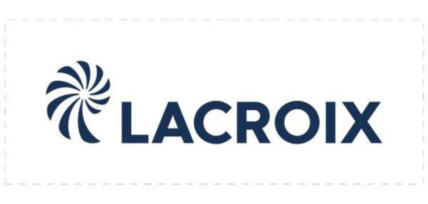
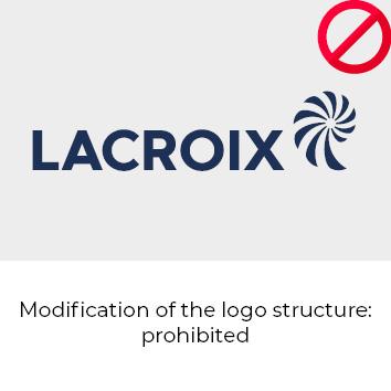
LACROIX logo includes two elements that are always inseparable and cannot be modified or moved: the nautilus and the name LACROIX.
Blue logo
Our blue logo in vector format, adaptable to all sizes.
White logo
Our white logo in vector format, adaptable to all sizes.
Black logo
Our black logo in vector format, adaptable to all sizes.
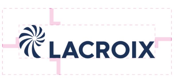
Clear space
To provide the required clear space around the logo, use the height and width of a standard capital letter ‘L’ – in the same height as the letters in the logo – as a guide.
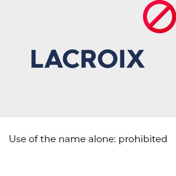
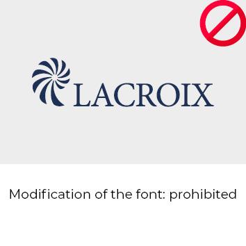
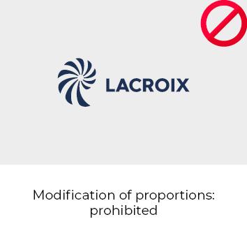
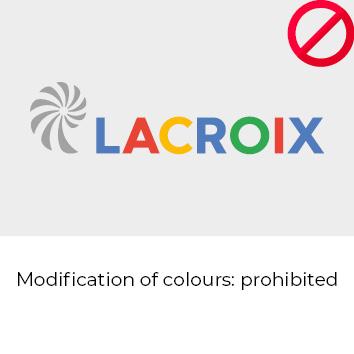
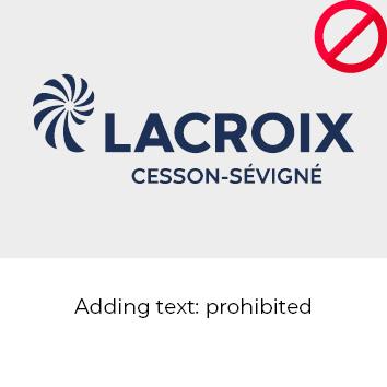
Logo Misuse
The appearance of the logo remains consistent. Logo should not be misinterpreted, modified, or added to. No attempt should be made to alter the logo in any way. Its orientation, colour and composition should remain as indicated in this document — there are no exceptions.
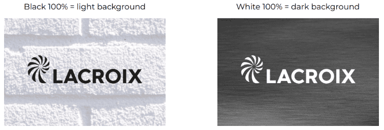
Technical constraints
On a medium where it is not possible to use the colour logo for technical reasons or manufacturing
costs (silkscreen printing, embroidery, etc.), it is recommended to use the logo in 100% black (on
light background) or 100% white (on dark background).
Colors
Each activity is composed of a single referenced colour. But the LACROIX logo must remain in blue.
Make sure to respect the colours codes below.

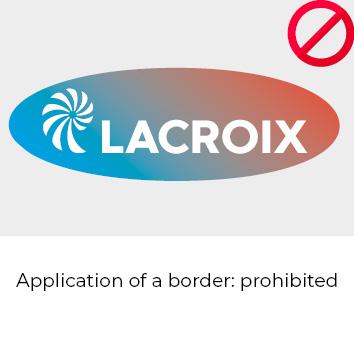
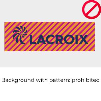
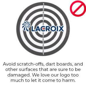
Considerations
Although it is possible to use our logo in many situations, some situations are not conducive to positive communication.
Let’s take a look at a few examples together.


Need help?
Do you have a question about the essentials of the LACROIX identity?
We are here to help you.